

Chandigarhmetro.com Magazine
Original price was: $40.00.$15.00Current price is: $15.00.
-
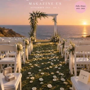
Step into the modern pulse of Chandigarh! We are launching the high-end digital lifestyle magazine ChandigarhMetro.com Magazine, which centers on the urban soul of Chandigarh and the surrounding three-city Tricity region. The magazine covers 11 categories of urban life, interprets the area’s distinctive temperament of “calm yet ambitious”, delivers content through in-depth narratives and stunning visuals, and includes 12 precise social media hashtags to drive traffic. #Chandigarh #Tricity #MetroLife #UrbanLifestyle #CityCulture #ChandigarhLife #ModernIndia #CafeCulture #Nightlife #StartupCulture #LuxuryLifestyle #UrbanStories
Description
About ChandigarhMetro.com Magazine
Chandigarh is a city most outsiders underestimate. People arrive expecting another north Indian metro and find something quieter. The sectors, the wide roads, the trees, Sukhna Lake — most of what visitors notice still traces back to Le Corbusier’s planning in the 1950s, and the city continues to run on that grid. What’s changed in the last decade is everything happening inside it.
ChandigarhMetro.com Magazine is a digital publication covering that change across the Tricity. The lifestyle, the culture, and the people who are building the version of Chandigarh that exists right now.
What the magazine covers
The publication runs nine sections. Metro Life and Hidden Chandigarh focus on the city’s character: how it moves day to day, and the places that don’t make it onto most lists. Café Culture and Nightlife handle the social spaces, from Sector 17 coffee mornings to weekend rooftops in Mohali. Chandigarh Architecture sits between Le Corbusier’s original work and the contemporary buildings being designed around it. Fashion and Street Style follows local creators and the looks driving them. Tricity Startups covers founders, coworking spaces, and the business culture growing across Chandigarh, Mohali and Panchkula. Wellness and Fitness reports on the gym, yoga, running and cycling scenes. Creative Chandigarh focuses on the photographers, artists, musicians and designers based here.
Who reads it
The audience is mostly students, young professionals and people working in IT, finance, design and the creative trades. Punjab University and the regional colleges feed a large part of it. Founders and the coworking crowd read for the business coverage. Lifestyle readers come for the fashion, architecture and café pieces. Local business owners read for visibility into what’s happening across the Tricity. The magazine is also written with luxury readers in mind, the audience that pays attention to how things look and how they’re put together.
Look and feel
The publication is cinematic without being cluttered. Layouts stay clean. Headlines run in bold sans-serif. Photography is shot for the magazine rather than pulled from stock libraries. The writing aims for an editorial read instead of a listicle one. The closest reference points are Apple’s restraint, Netflix’s cinematic framing, and the design language of contemporary architecture and lifestyle magazines.
The colour palette pulls from the city itself. Matte black, white, the grey of Chandigarh’s concrete, neon blue for the night scenes, deep green for the gardens and Sukhna’s edges, warm beige and metallic silver for the premium work. Typography stays minimal: bold where it needs to land, restrained everywhere else.
Tone
The tone is confident and modern. Premium without being heavy-handed, youthful without trying too hard. The aim is to read like a real magazine published in Chandigarh by people who actually live here, not a tourism brochure and not a generic city blog. The intelligence behind the writing is meant to come through in the specifics: which café, which street, which building, which founder. Not in adjectives doing the work.
That is what ChandigarhMetro.com Magazine is for. The city’s daily life, in print quality, written by people who know it.
Reviews
There are no reviews yet.