Open-Box Electronics: The Smartest Way to Buy Tech in Canada Right Now
Canadian tech buyers are in a squeeze. Prices on monitors, peripherals, and smart home gear keep climbing, the dollar isn't...
Read moreDetails
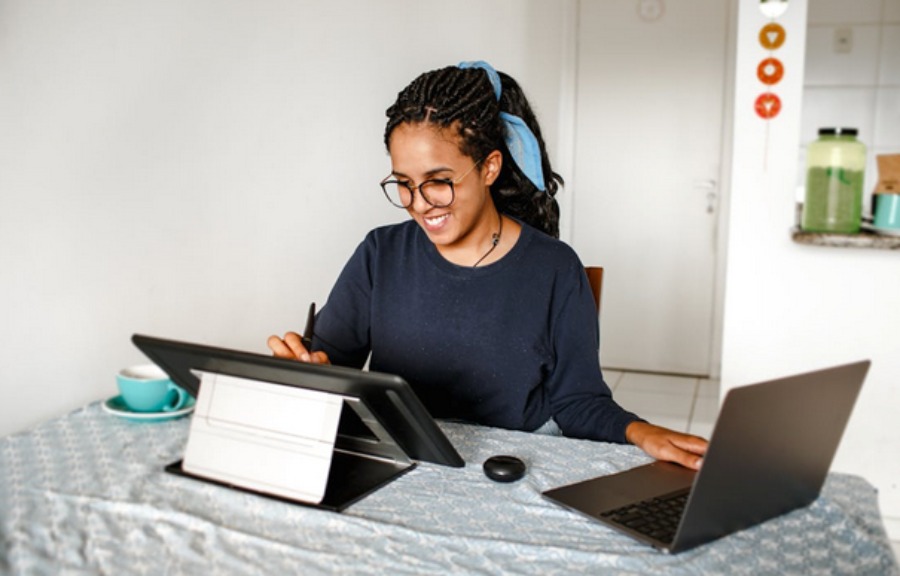
Most Mac users take screenshots with one shortcut they memorized years ago, then open the image in some other app to draw an arrow on it. That’s a lot of wasted steps, because macOS ships with a genuinely capable capture-and-markup setup that most people never fully discover. Screenshots have quietly become one of the main ways people explain things to each other, so it’s worth knowing the tools properly rather than fumbling through them. Here’s the whole thing by task: grabbing the shot, marking it up and knowing when the built-in stuff genuinely isn’t enough.
The built-in capture options do more than most people realize and picking the right one saves you cropping later.
One small trick worth adding: hold Control along with any of these and the capture goes to your clipboard instead of saving a file, so you can paste it straight into a message or document without leaving image clutter on your desktop.
Here’s the part that saves the most time and that most Mac users have never touched. After you take a screenshot, a small thumbnail floats in the bottom-right corner of your screen for a few seconds. Most people ignore it and let it disappear.
Click that thumbnail and macOS opens the shot in Markup, it’s built-in annotation editor, no third-party app needed. From there you get the tools that cover the vast majority of what anyone needs a screenshot for:
If the thumbnail vanishes before you catch it, you can get the same tools by opening the saved image in Preview and clicking the Markup icon, the pen-tip button in the toolbar. Same editor, same tools.
Having the tools is one thing, using them well is another and the rule is restraint. A screenshot with six arrows and four highlight colors communicates less than one with a single arrow. A few sensible defaults:
Use an arrow when you need someone to look at one specific spot and only one. Use a box or circle when you’re referring to a whole region, like a section of a form. Add text when the image alone won’t carry the meaning and keep it short. Highlight sparingly, it’s power comes from being the only thing marked. And crop aggressively, since cutting the irrelevant 70% of a screenshot does more for clarity than any annotation you could add to it.
The one habit worth building deliberately: check what else is in the frame before you send. Screenshots casually capture email addresses, account numbers, open tabs, notification banners, names in a sidebar. Cropping the sensitive part out is the cleanest fix; where you can’t crop it, obscure it. This matters more than any other annotation decision because it’s the one with actual consequences.
For most everyday use, the built-in tools are genuinely enough and installing something else is solving a problem you don’t have. But there are real cases where a dedicated app pulls ahead:
If you produce documentation or tutorials regularly, dedicated tools add things Markup lacks, numbered step callouts, blur and pixelate tools for redacting sensitive data properly, scrolling capture for full web pages that don’t fit on screen and reusable templates so a set of screenshots looks consistent. Faster sharing workflows, where a capture uploads and copies a link automatically, are also a genuine time-saver if you’re sending screenshots all day. If that’s your situation, it’s worth comparing the snipping tool options for Mac against what you actually need rather than installing the first one you find.
If you take a handful of screenshots a week to show a colleague something, the built-in shortcuts plus Markup will serve you fine indefinitely.
It’s not an accident that screenshots became this central to how people communicate, they’re now a documented object of study in media and communication research, precisely because so much of modern conversation, evidence and instruction now travels as an image of a screen. Which is a decent argument for taking two minutes to learn the shortcuts properly. Learn the four captures, remember the thumbnail opens Markup, crop more than you annotate and check the frame before you hit send. That covers nearly everything and you’ll stop reaching for another app to draw one arrow.

Canadian tech buyers are in a squeeze. Prices on monitors, peripherals, and smart home gear keep climbing, the dollar isn't...
Read moreDetails
Copyright © 2024 NoodleMagazine - All Right Reserved